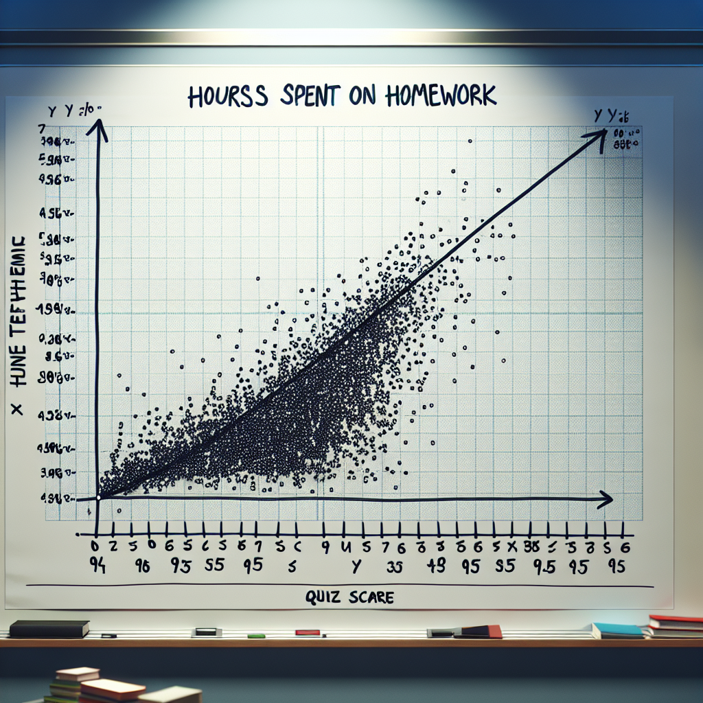
Avani's math teacher plots student grades on their weekly quizzes against the number of hours they say they study on the pair of coordinate axes and then draws the line of best fit. What is the meaning of the xx-value on the line when y=95?
A student's actual quiz score after spending 95 hours on their homework.
The number of hours a student actually spent on homework before earning a score of 95 on the quiz.
A student's expected quiz score if they spent 95 hours on their homework.
The number of hours a student should spend on their homework to expect a score of 95 on the quiz.
The meaning of the x-value on the line when y=95 is:
The number of hours a student should spend on their homework to expect a score of 95 on the quiz.