Design a visual representation of statistical data using a box-and-whisker plot. The image is to communicate the concept about the average daily temperatures in December in Tucson, Arizona. The data points to be represented are: 67, 57, 52, 51, 64, 58, 67, 58, 55, 59. Ensure that the elements of the box plot such as the median, quartiles, and outliers are clearly demarcated. The scene should feel as though it's a part of a statistical investigation or a classroom scenario, perhaps displayed on a digital screen or a whiteboard. Please make sure the image contains no text.

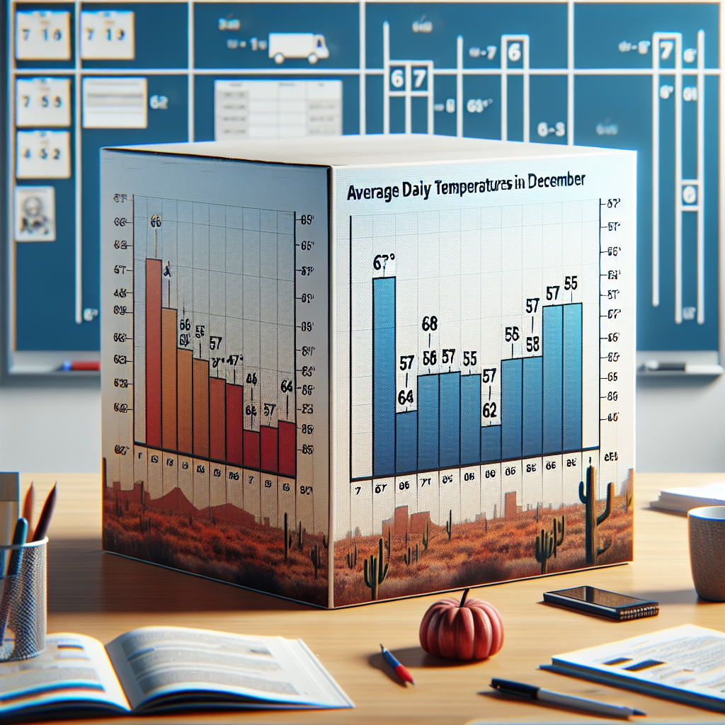
Make a box-and-whisker plot of the data average daily temperatures in Tucson Arizona in December 67 57 52 51 64 58 67 58 55 59

I am confused on how to do this

1. b. mean=75.8, median=76.5, mode=63

2. a. dots at 50, 53.5, 58, 62.5, and 67
3. c. 30th percentile=105, 90th percentile=176.This is a controversial question because some of the numbers repeat, but as of 5/19, answer c is right.
4. d. mean=8, variance=18.3, standard deviation=4.3
5. a. 2
6. b. 22%
7. d. a^6-30d^5+375d^4-2,500d^3+9,375d^2-18,750d+15,625
8. a. 93%
9. b. 16%
10. c. 84%

"TK" is 100% right for the Normal Distributions Quiz! Thanks a lot, my dude. It's hella appreciated.

^^^

100%just took the quiz

TK is still correct!

tysm tk! 100% correct.

THX Love!

I WAS LOOKING SO LONG FOR THIS THANK YOU!!

TK still right!

TK’s still right for 2022, just for anyone who still needs help :)

you’re amazing tk