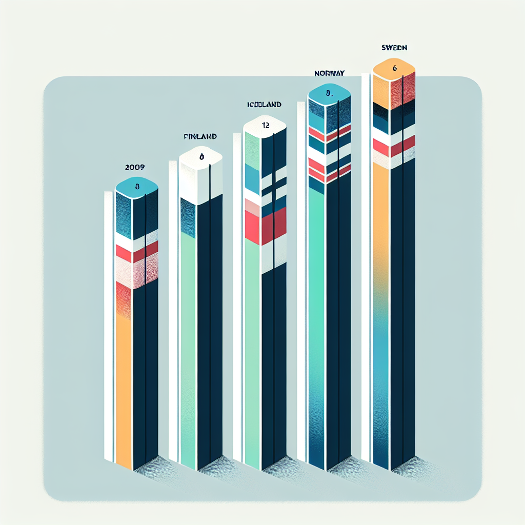
Study the graph.
A graph shows the number of carbon emissions in Scandinavia. Emissions are shown in metric ton. In Denmark, there were 8 in 2009 and a little over 8 in 2010. In Finland, there were 10 in 2009 and a little over 11 in 2010. In Iceland, there were a little over 6 in 2009 and slightly less than that in 2010. In Norway there were almost 10 in 2009 and nearly 12 in 2010. In Sweden, there were almost 5 in 2009 and over 5 in 2010.
Which of the following statements accurately describes the information presented in the graph?
A. Sweden reduced carbon emissions the most.***
B. Iceland produced more total carbon emissions than Denmark.
C. Norway produced twice as much carbon emissions as Finland.
D. All countries but Iceland had an increase in emissions.
Yes, D.
Is it D?
No. Your answer is wrong.
Study the data.